Katona Winery
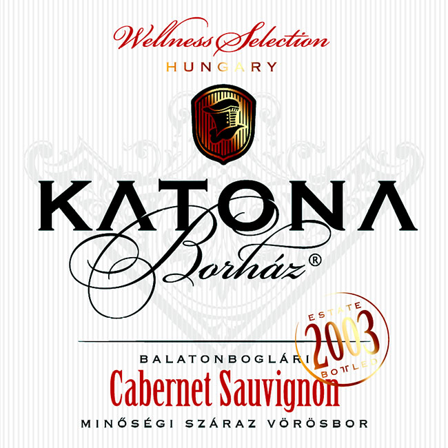
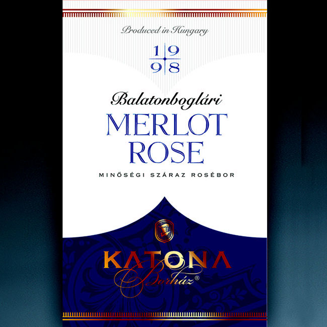
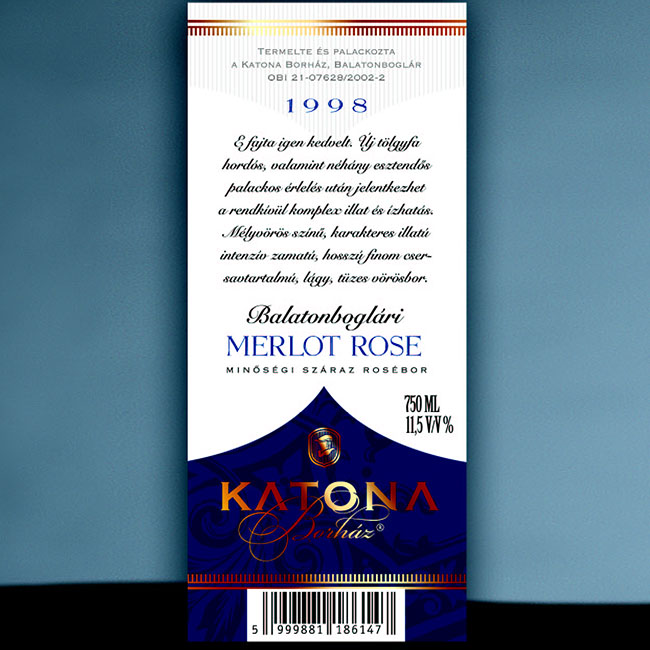
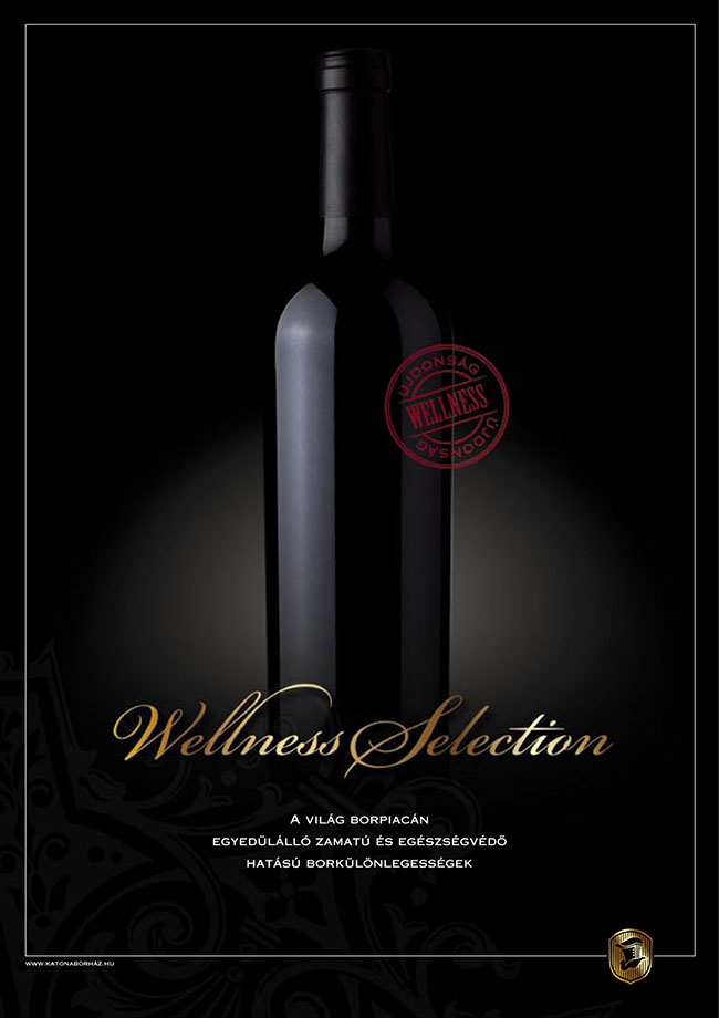
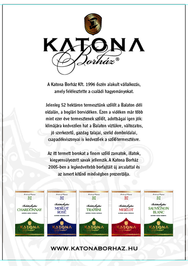
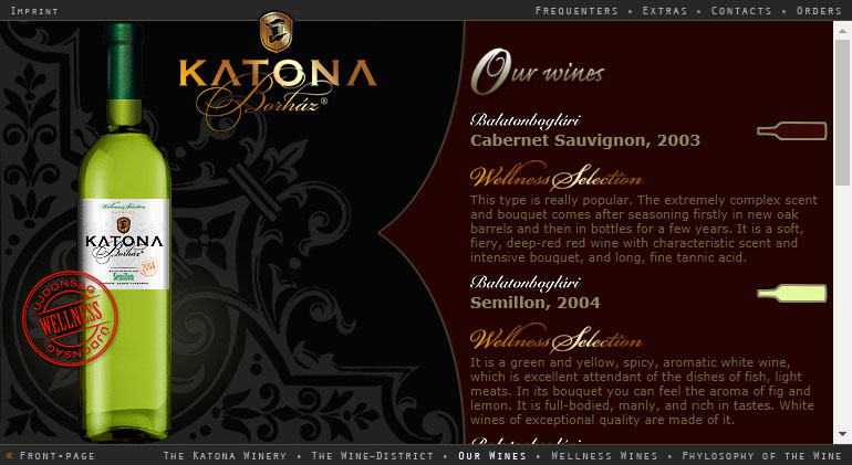
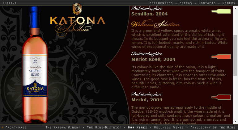
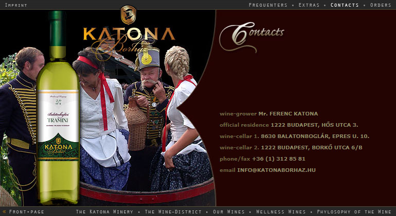
Katona Borház represents one of the best wine regions in Hungary, the Balaton Uplands. This in itself was already a good basis for cooperation anno.
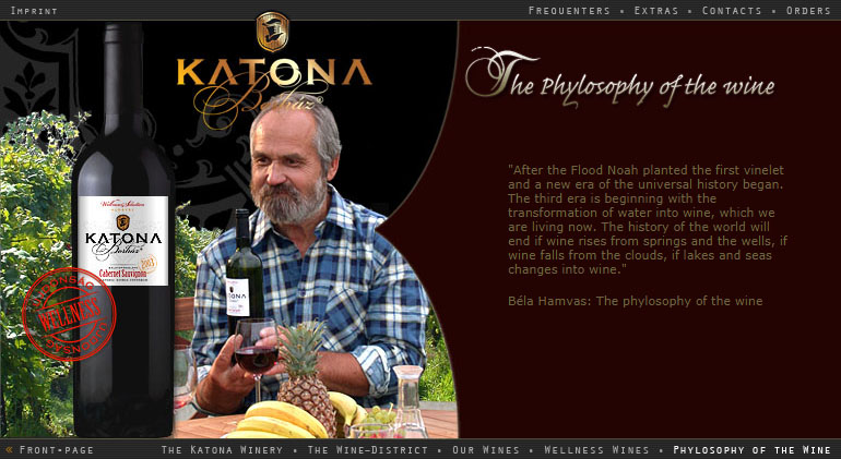
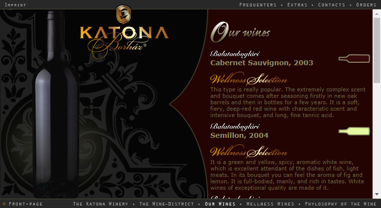
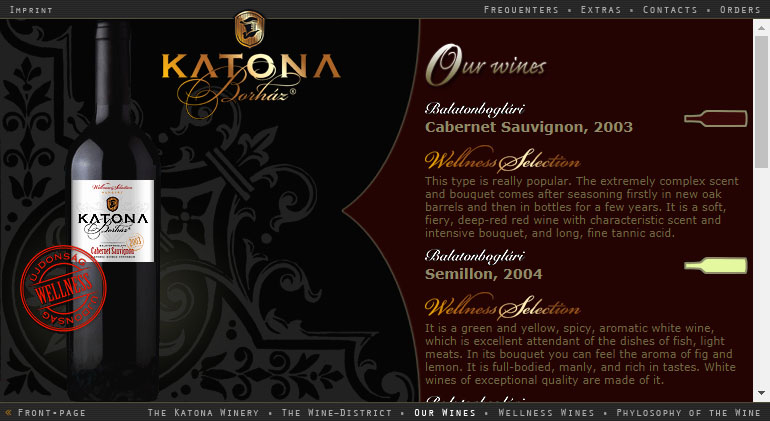
The goal was to get into the premium category and that required a percussive design and style that was also usable, of course. This work of mine was done many years ago, which is why it is now technically out of date, yet I am proud of it, because I feel that we have managed to achieve the set goals and it still doesn’t look bad today. The original website contained some animated Macromedia (Adobe) Flash elements, an intro for exemple, which would be difficult to reproduce here unfortunately.
PROJECT
Website building
CLIENT
Katona Winery
DATE
May, 2005.
DESIGNER
Balázs Simonffy
CODING
Balázs Simonffy
